
This infographic is meant to provide visual data about renewable energy to make it easy for viewers to follow and understand. In this infographic, data is represented by charts, colors, and symbols that reduce the cognitive load of the large data. This makes it easy for the learner to understand and recall the information.
When designing this infographic, visual design principles like balance, alignment, contrast, and color were applied to engage the viewer.
Adobe Illustrator was used in designing this infographic. Some of the assets were gotten from the video tutorial, " Creating Infographics with Illustrator CC (2013)" by Mordy Golding. This infographic is a variation of what was produced in the video tutorial.
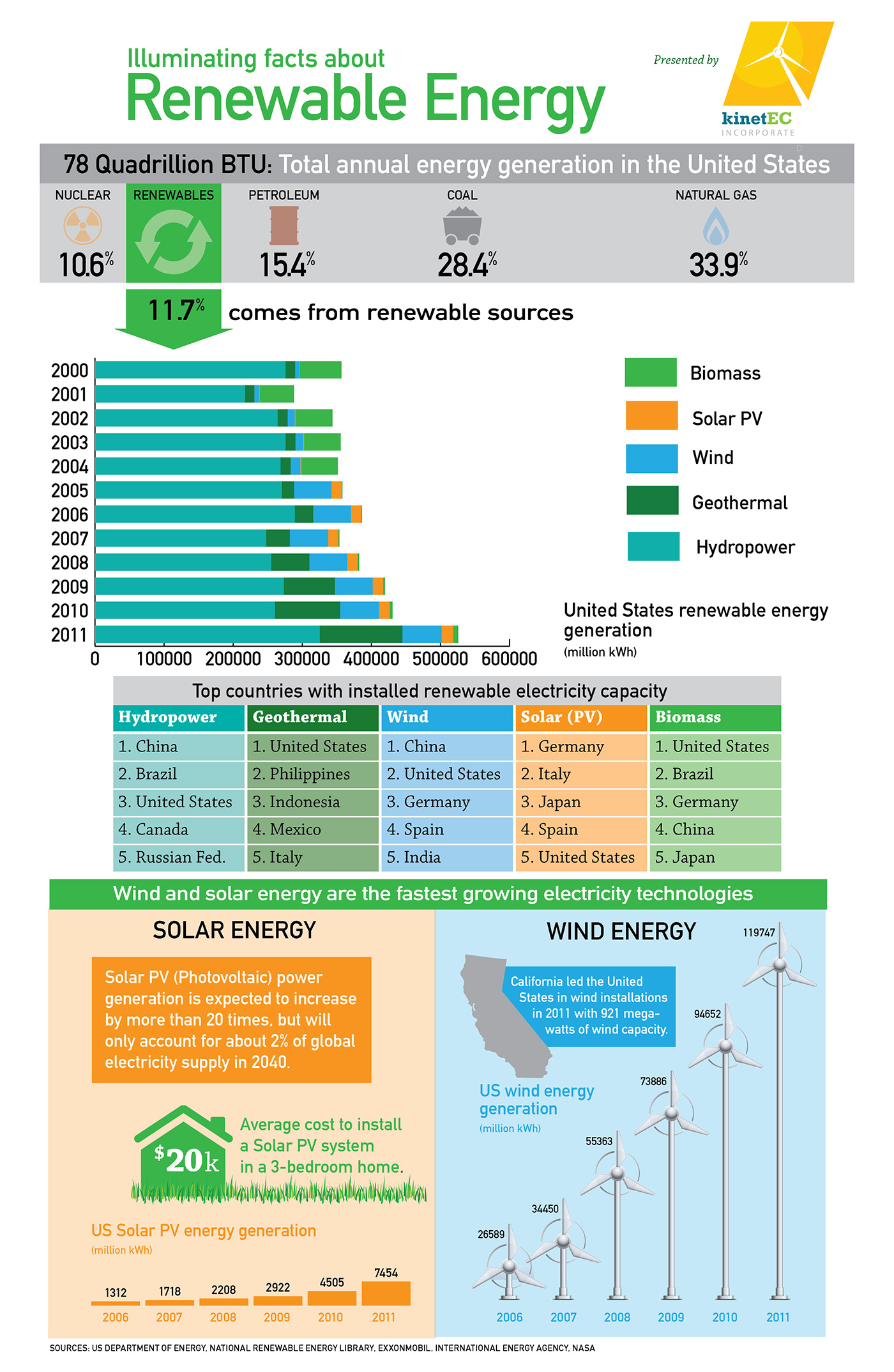
Infographic illustrating facts about renewable energy


